Drawing Aircraft:
Step 2 - Adding Colour
Adding Colour: Importing the paths
I am going to talk Photoshopspeak from here on as this is the only pixel painting program I know. I am sure you can get just as good results out of different programs, but Photoshop does all I want, so I have not (yet) ventured further. (Much to some peoples' disgust!)
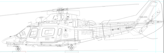
If you have selected all the paths in Illustrator and copied them to your clipboard, you can now import them into Photoshop. If you use the Paste command, Photoshop will ask you how you want the material on the Clipboard imported. Say "Paths". You'll then have one path with all the individual linework you have imported from your vector drawing program.
With that path activated, it should look something like this...
Colouring-in
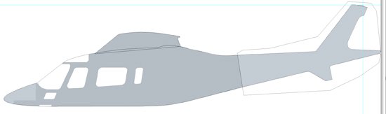
Here comes the fun, instant gratification part. In Photoshop create a new layer set and call it "Fuselage" (or whichever bit you want to work on). Make a new layer within the set and call it "Fuselage (or whatever) Paint". Now go to your paths and select whichever path you have as the extreme outline of the fuselage.There are two ways you can go from here.
Way One:
Make this path into a selection, and fill it with the appropriate colour. If you need more than one colour of paint, say for a camouflage scheme, you can change brushes and paint colour and paint away to your heart's content.
Way Two:
If you are a bit more advanced in the Dark Grey Art of Photoshopping, you can select the appropriate path and turn it into a layer clipping path for the Fuselage Paint layer so that any paint outside the path won't be seen. The advantage of working this way is that the path remains editable (live) so by shifting any part of the Layer Clipping Path, the colour will follow without having to re-paint and you won't have to keep reselecting stuff. This is the way I work. It makes tweaking bits later a lot easier.
Here is the fuselage blocked in ...
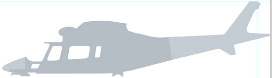
... add the hoist and the undercarriage doors ...
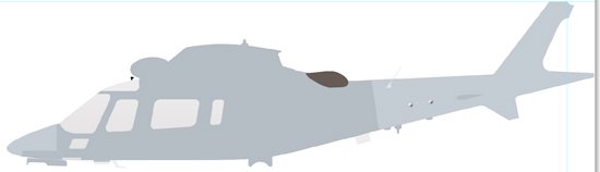
... and the jetpipe, horizontal stabiliser, aerials and windows ...
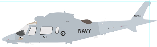
... and the interior and the markings. You should end up with something very flat and blocky like this ...
As you build up layers upon layers, be aware of what should be in front of what. One of the advantages of layers is that you can rearrange them to put one thing behind or in front of another. I tend to work from the back of an image forward. That is, in this case, I did the rescue hoist first, as it appeared on the far side of the chopper, then the engine cowling, then the fuselage, on to the exhaust, the horizontal stabiliser, the undercarriage sponson, the undercarriage itself, and the undercarriage doors. Once I was happy with the arrangement of the colours and layers, I created another new layer set for the markings.
This process can be continued, blocking in even the smallest details, or you can leave that until later. I stop the painting at this stage and start with the shading. That way, when I come to do the smaller details, I can paint and shade them knowing what their surroundings look like and shading them appropriately. It saves a bit of backwards and forwardsing later.
Think Ahead!
The other huge advantage of working with layers this way is that you can quite quickly and easily make changes and create completely different versions from the one base illustration. One of the thoughts that is foremost in my mind as I construct one of my illustrations is "What do I need to be able to change for other versions of this illustration?" In other words, I am constantly planning ahead and not making changes I can't undo later.
You will probably find several similar versions of your subject as you collect reference material and you may want to create illustrations of all of them. The more flexible you make your base illustration, the more easily you will be able to create variations later. I guess this one fact is the big trade-off between traditional paint-and-canvas art and doing it on the computer. While it is a lot more difficult to get the same "life" out of a digital painting (I'm leaving myself wide open here, I have seen some pretty lively digital art!), it's is a lot faster, correcting mistakes is a lot easier and you can make innumerable variations without affecting the original.
So that's the colouring-in bit. You now have an identifiable aircraft profile. For a decal placement diagram or a colour scheme depiction, this would be fine. It is relatively accurate and it shows the pertinent information. But we want a bit more than that, don't we. We want to give it that spark. We want it to come alive and jump off the screen at us. Thats where the next stage helps: Shading.
Go to Drawing Aircraft page from Colour page
