Shading: Drawing Aircraft - Step 3
This page was last updated 17 January 2013
Now we get to breathe some life into our flat illustration. This is also where all the research helps. I find that a real intimacy develops between myself and the subject as I study it and become familiar with it's subtleties, nuances of curve and small details. It becomes easier to pick the differences between variants and you can start to spot non-standard modifications and unusual configurations. This really comes to the fore in the Shading and Detailing stages.
Blowing it Up
If you think of what we have created so far as being a an inflatable pool toy, fresh out of the pack and flat as a tack: we are about to blow some air into it and give it some shape and form. Study your references. Study your references. Study your references. Be aware of just how thick the wing is, just how thin the tailfin is, just how round, square or triangular the fuselage is, how smoothly one piece blends into another, or indeed how smoothly it doesn't blend in! The droop of the rotor, the twist of the prop. Soak it all in. I often build a scale model of my subject, paint it grey, and use it as a reference for shading and form. Rotating it under a lamp can give you a whole new perspective on how the shape works. You get to make aeroplane noises too!Aircraft Profile Philosophy 101
The human eye is very, very hard to trick. A viewer may not be able to put their finger precisely on what is wrong with an image, but they will instinctively know that SOMETHING is wrong. That is why photos of scale models are so seldom convincing and how we can pick when something has been "Photoshopped". There are simply too many ways the human brain applies checks and balances. It looks at surface detail, compares it to size of subject, cross references that to reflectivity of surface and gloss levels, thickness of edges, notices intensity and direction of light and fall of shadow and expects to be able to tell if one thing is nearer or farther away than another. All this happens in a split second, and a decision is made about whether the image is convincing or not.
Fortunately, with aircraft profiles, no-one is expecting them to be convincingly realistic. The observer sees a geometrically perfect side view of a machine and instantly knows it is a fabrication. That perfect side view simply doesn't occur in nature. In real life there is always some element of perspective thrown in, so therefore the viewer says to themselves "What I am seeing is not real".
This actually works in our favour. The closer we get to reproducing the details of that aircraft realistically and completely, the more the viewer experiences that transition: "I know it is a fabrication because it is in perfect profile, but it is SO CONVINCING." It is at this point that the illustration becomes breathtaking. Now, is that a goal, or what!? It is certainly my goal!
Keeping it Real
Back to work. Did I say "Study your references"? To each layer set we created earlier, we are now going to add Shading and Highlighting layers. So, for arguments sake, we go to the Fuselage layer set. Select the Fuselage Paint layer you created at the start of Part 2 and create a new layer above it in the layer stack. If you select "Use previous layer to create clipping mask" as you do this, the new layer will automatically be masked by the layer immediately below. I usually do this. Then I don't need to worry about painting outside the lines, Photoshop has taken care of it for me.So we are creating a new layer above the paint layer, we have the clipping mask option activated, I would name the file "Fuselage shading" and make the blending mode either Darken or Multiply. Now we have a layer that, when we paint on it in black, it will darken the the Fuselage Paint layer immediately below. Now we do the same, creating a new layer named "Fuselage highlights", activating the mask feature and making the blending mode Screen or Lighten. On this layer we will add the highlights which will lighten off the colour on the Fuselage Paint layer.
Shading
Activate the Fuselage shading layer and grab a brush. Make it a reasonably large and soft brush, make the colour black, or a very dark version of your fuselage colour, and drop the opacity to around 2%. Use this to slowly build up shading and shape on your Fuselage shading layer. Make the brush bigger or smaller as you work up larger or tighter areas and shapes. Add some texture if needed. Practice practice practice. Make the brush quite small, but still soft, and set the opacity to around 5%. Go around all the edges of the fuselage, top and bottom. Why the top? Look at your references again.Keep going, adding shading here and there until YOU are convinced of the shape you are seeing. If you think that it is "good enough", it probably isn't. You have those same human eyes as the viewer you are trying to convince. If you know something is not quite right, you can accept it or revise it. Ultimately, it is not going to be perfect anyway (just because nothing ever is, not because you can't draw!), so it is your call when close enough is good enough.
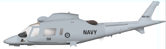
Here we have some shading applied to the fuselage layer set ...

Now we do the same thing to all the other bits we have painted so far. Then we get something like this ...
Highlighting
Highlighting is a similar process to shading. It generally happens in a smaller area. In some ways, the shading gives you most of the shape and the highlight gives you most of the texture. Check your references. Is the paint on your subject really as flat as you think? There are not many things in the world that are truly matt and non-reflective. Check out some books about the Vietnam war, there is almost always a lovely air-to-air shot of a Phantom II or a Thud at high altitude with the light from the sunset bouncing off the wings like they were polished. Back on the ground that same aircraft might look like chalkboard.The higher the gloss on a surface, the brighter the highlight and the sharper its edges. Think of those wonderfully shot car ads with the crisp highlight running from end to end. The more matt a surface is, the softer and more diffused the highlight.
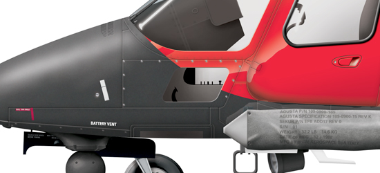
Here is a good example showing a glossy surface right next to a matt surface. Compare the highlights on the windscreen, nose and door...
So grab your soft, small brush, select white as your colour, drop you opacity to 4-5% and start on some highlights. Work carefully and slowly. Don't forget, because you are working on a separate layer, it is dead easy to delete what you have done and start again, so don't be afraid to experiment. If you want to create a really hard highlight, say for a canopy, you could even create a path to define its edges, make that a selection and then brush in the white till you are happy.
Remember this too, just like a perfect side on view doesn't occur in nature, neither does utter black or stark white. If I am painting something solid white, like lettering or markings, I usually use 10-15% grey. By the time shading is added it will often darker considerably again, but your eye tells you it is white. Likewise, I seldom go darker than 85% black, this also leaves space for some shading.
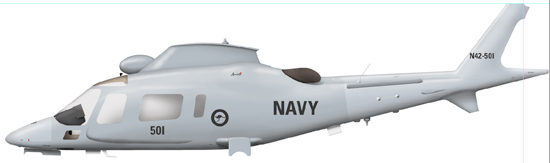
Here is our illustration with highlights applied ...
Cast Shadows
Last thing to do in this section is to add the cast shadows. Cast shadows are those that fall across one object from an object above. The classic example is a tailplane casting a shadow down onto the rear of a fuselage. I do these separately from the shading, on new Cast Shadow layers, so I don't need to think about them while I am sorting out the shape and form. Create a new layer below the object casting the shadow and above the layer being shaded. Keeping in mind the light source you have chosen, think about the shape of the shading object and the way the shadow will fall across the shape underneath. It will very seldom be a straight line. Should I say it again? Check your references. Even play with pens and rulers and a desk lamp until you get an understanding of how the shadows fall. Pick up the model again.Now we have an illustration looking something like this ...
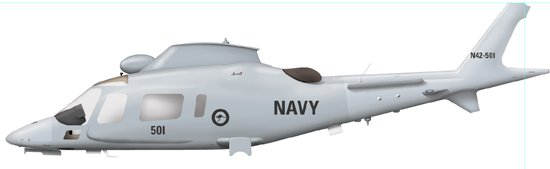 We now have something that is looking quite realistic. It has colour, it has shape, it has form, it has texture.
But the Devil is in the details ...
Go to Drawing Aircraft page from Shading page
